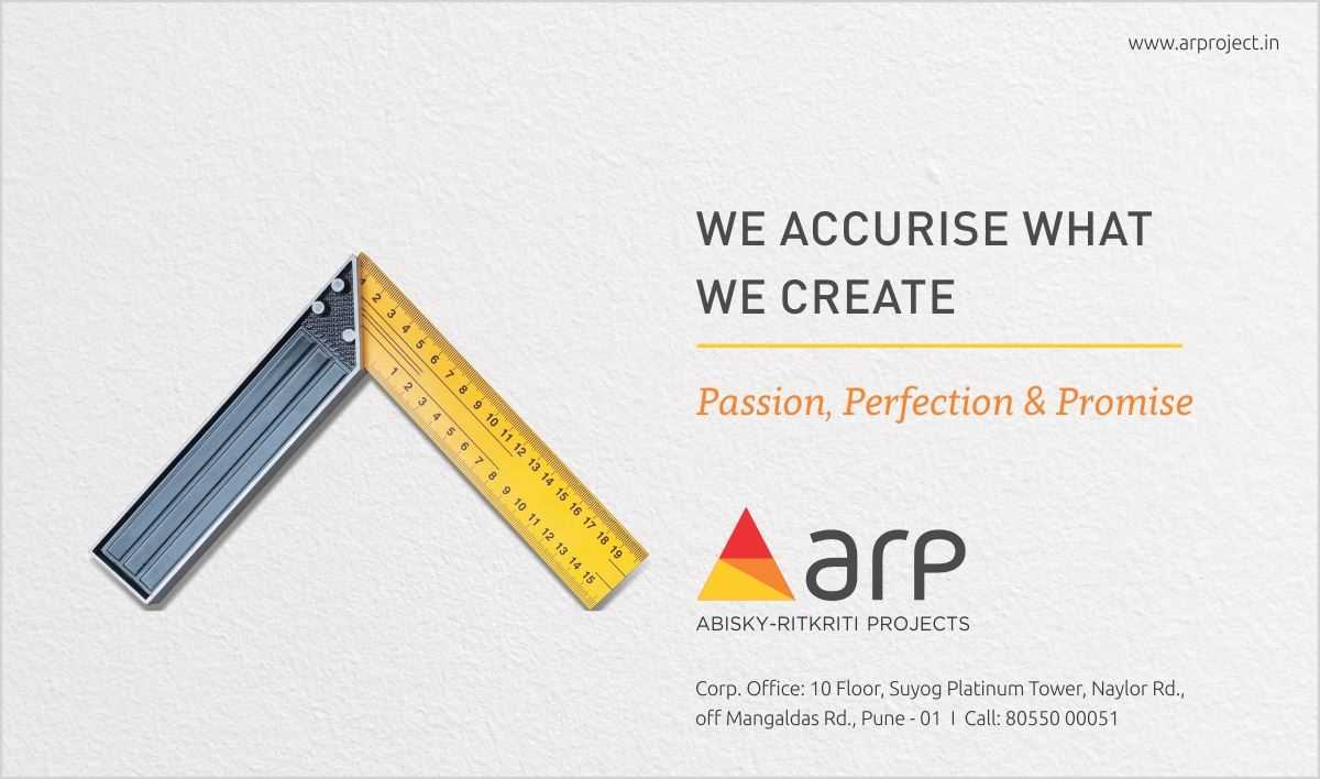
AR Projects
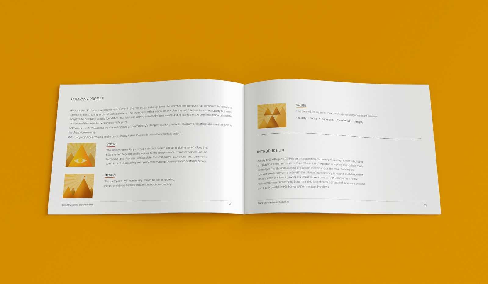
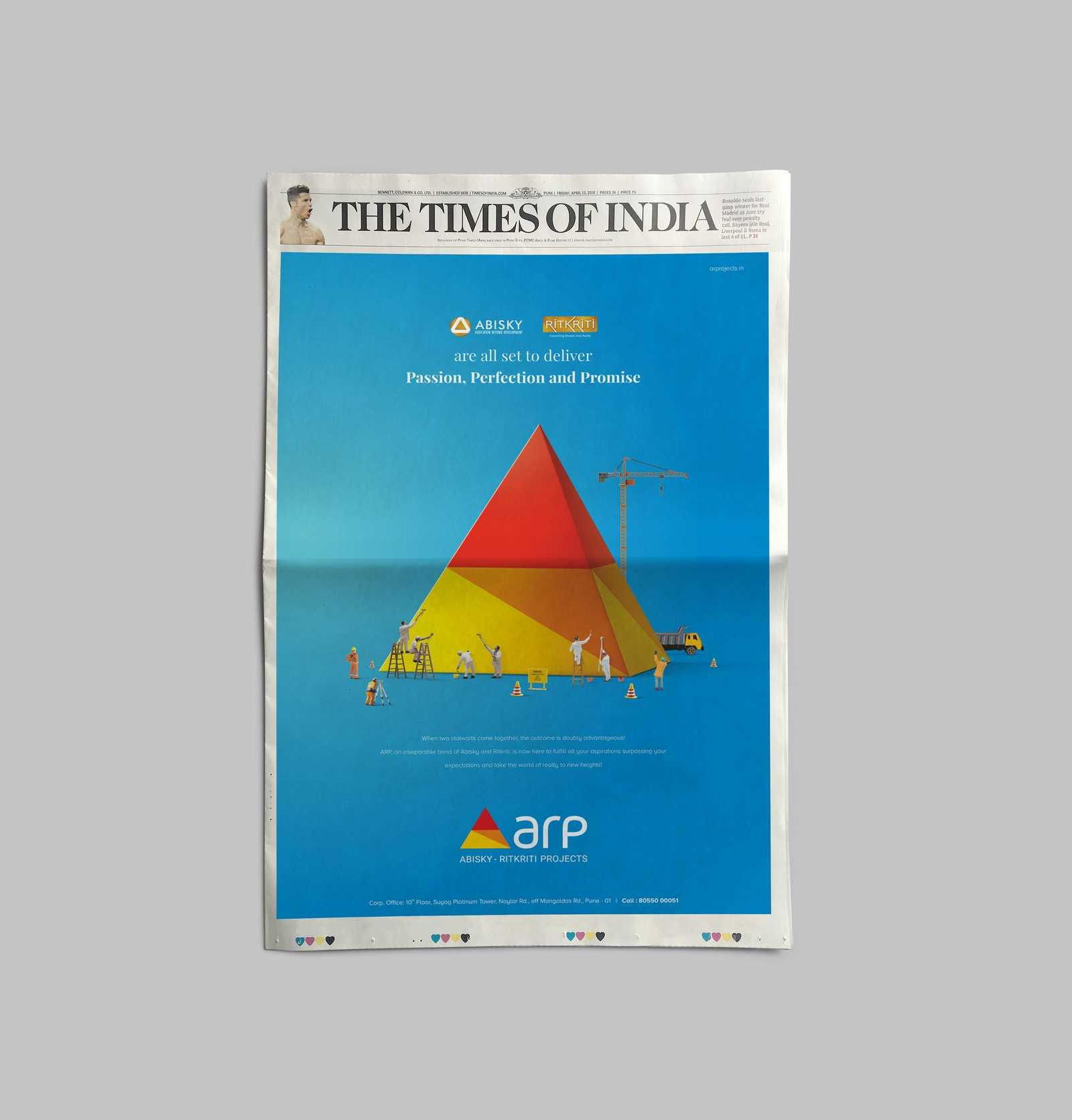
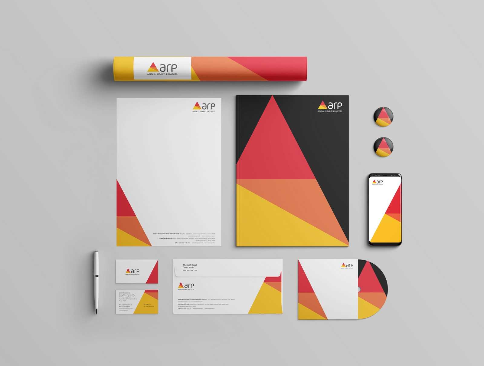
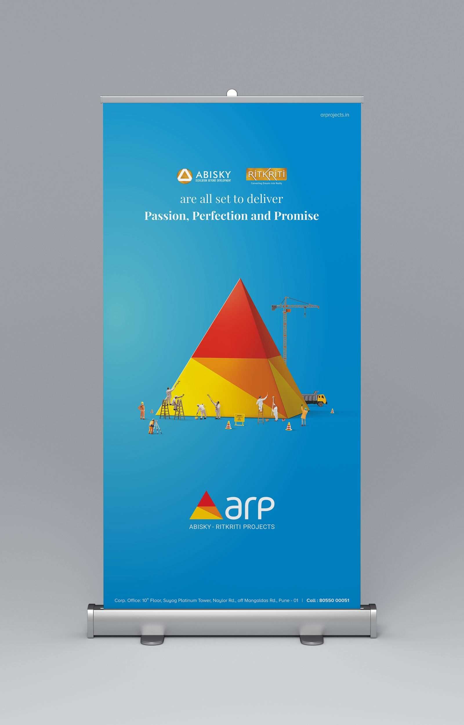
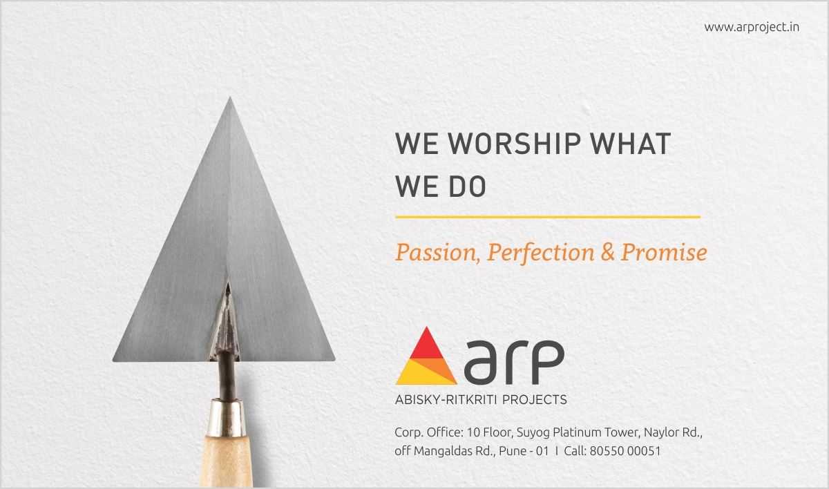
When the two renowned realty groups- Abisky and Ritkriti- decided to come together under one single identity; there was a need to create a new logo. It announced the arrival of this new entity with its vibrant, positive and emphatic colour scheme. The perceptible ‘A’ also has a shape of lord Ganesha. This was sure to strike a chord with the people in its unique, artistic way.
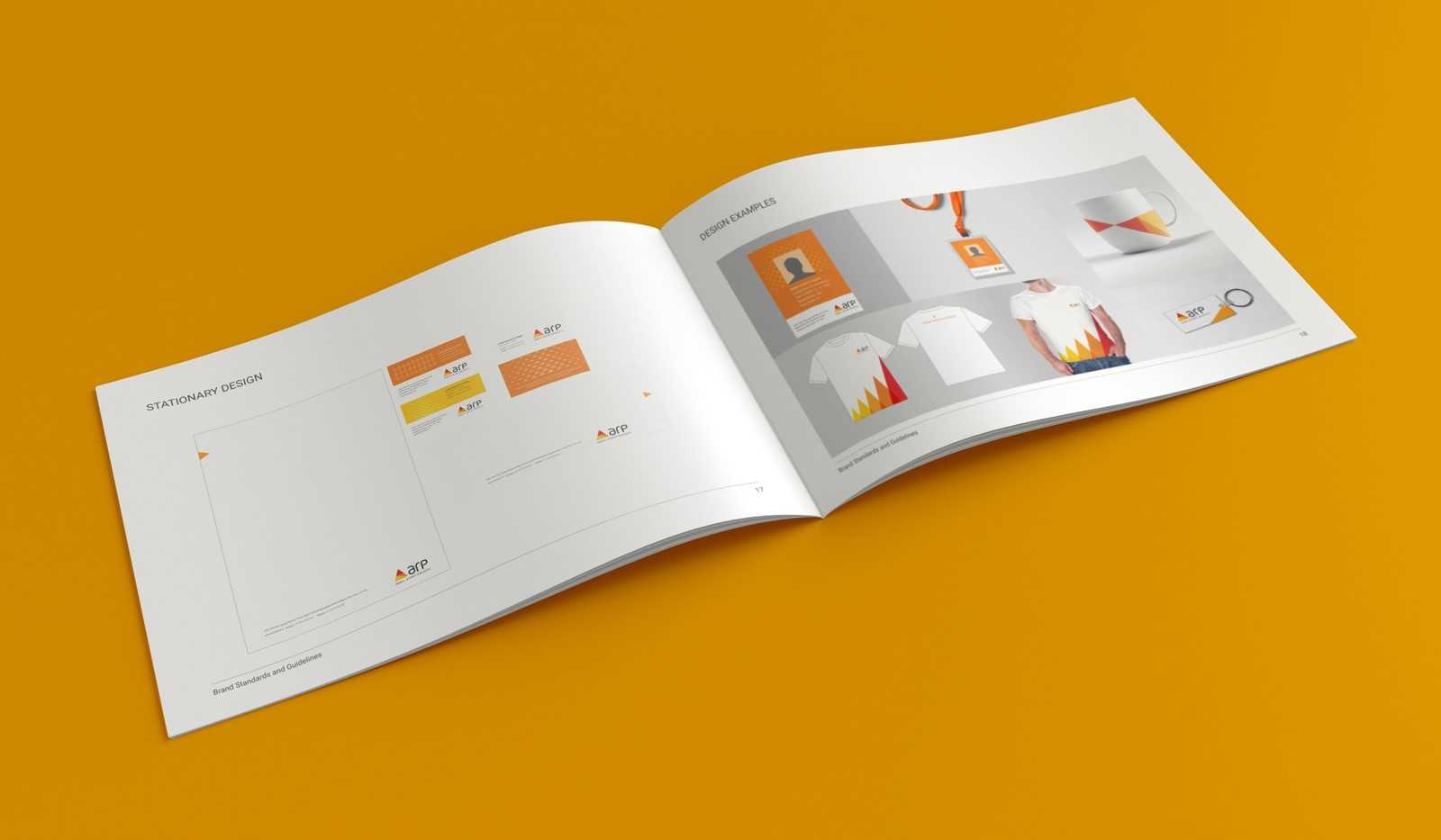
- Corporate Branding
- Environmental branding
- Digital Media Promotions
- Corporate AV
- Promotional Campaigns
Brand guidelines : A prerequisite to brand identity
This exercise started with revamping the logo and soon we realised the need of some well conceived brand guide lines. Creating brand guidelines is indeed a challenging job. It’s something that gives a brand its identity and of course, integrity.
When we created brand guidelines for ARP, we quite enjoyed the experience. We revamped the logo and integrated it in every bit of communication through these guidelines… and the impact is for all to see!
- ClientAbisky Ritkriti Projects
- IndustryReal Estate
- ServicesCorporate & Environmental Branding, Brand Guidelines, Website
- Websitewww.arprojects.in

Mission rebranding – successfully accomplished!
I personally thank team 3 Dots for revolutionizing brand ARP with a dynamic logo, streamlining our brand guidelines and executing corporate office branding.
Pranay Shingi Director, ARP