This time someone did read between the lines (pun strongly intended). Logo controversies hit a new height with the Myntra brand logo being misinterpreted for all the wrong reasons. Well, here’s a solution to all the brands facing the issue of being misunderstood. Remember the classic cult movie Thank you for smoking? Nick Naylor nailed it when he said, “That’s the beauty of an argument. If you argue correctly, you’re never wrong.” With that thought, here’s another #DotsFired and we will be speaking about the probable solution that can be adopted by all brands henceforth.
Our Thoughts:
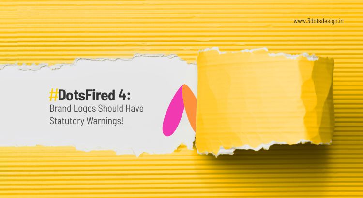
Brands should definitely reintroduce their logos with statutory warnings from now on. Why not? Every letter in the alphabet is open to be misconstrued. If we cannot use the letter in its basic form, we are afraid our education system would be including hieroglyphs as our first language in schools and we all would be learning it by force. If not, we should all possess a basic sense of alphabetic and colour comprehension.
A fine arts student spends almost INR 40,000 per year to learn colour theories, contrasts, high keys, low keys, gradients, and whatnot. When someone who doesn’t understand the intricacies of design thinking makes a controversial statement like “it looks offensive”, it definitely sparks a war. And, knowing what artists think and feel, they would fight back with the power of art itself.
Speaking of art & artists, there’s a lot of thought that goes behind creating a brand identity. There are several spoken, written, unspoken and unwritten rules that artists follow (willingly) to ensure that the logo represents the brand in its entirety. Here are the steps that they follow –
The Brand Is Assessed Thoroughly:
The reason why a creative brief plays a significant role in creating a brand identity is crystal clear – it represents the whole brand. A lot of information is required to create one particular design element.
Research Is Mandatory:
To avoid plagiarism and other “offensive” counterattacks that the brand can possibly face, the branding agency professionals conduct meticulous research so that the brand logo stands out from the rest in the clutter.
Where Will The Brand Logo Be Seen?
While creating a brand logo, the designers have to account for its presence across all platforms. Will it be seen in print, outdoor, packaging, websites, or merchandise… the feasibility of all these aspects are considered while creating even a single stroke of the line.
The Artists Get On Their Drawing Boards:
When they lay a foundation with heavy research and all the intricate details, only then the artists get on the drawing board to brainstorm and ideate. They begin to sketch a few prototypes.
They Move The Rough Sketches To Their Computers:
When the artists are sure of which design they would want to develop, they would start designing the logo on their computers using their preferred software. In this process, they add all the minuscule details, experiment on colour and typography to check what suits the brand personality.
There Are Always Feedback And Versions:
Seldom there are times when the logo got approved on the first go. Clients always have feedback on what they need and don’t need in the logo (sometimes they are unable to say which is which). But, the artists help them by designing versions that the clients can comprehend. Artists always have this one “unique” habit of designing two options – one that they love; one that the client would love. They are never the same in most cases.
Print Files Are Delivered When Approved:
Finally, when the client gives a go-ahead to a brand logo that’s been approved internally by all the departments, the agency delivers the design & print files in the format preferred by the vendors.
At 3 Dots Design, we understand the involutions involved in creating a brand identity. Designing a logo is more than just a daily job for us. Just as the client puts their noteworthy efforts behind making it stand out from the crowd, the entire team at 3 Dots Design ensures that your brand logo will not be pointed out by anyone saying – “it looks offensive”. If they do, we can very well share the link of this blog with them and make them understand (with or without statutory warnings) all that goes behind creating a brand logo.